
Nowadays, having a mobile-friendly website for your business is more important than ever. In fact, websites are expected to work properly on several different devices: tablets, desktops, and smartphones. If your business doesn’t have a mobile-friendly website, chances are high that your visitors will quickly leave and look elsewhere. Users simply want websites that are easy to read and navigate. Therefore, today we share a checklist that will help you ensure that your website is as mobile-friendly as possible.
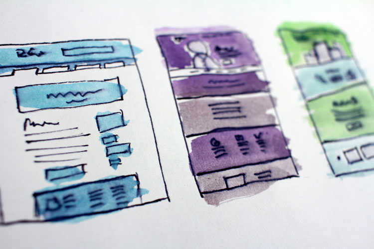
1. Say no to dual websites: choose a responsive design!
A while ago, it was normal for businesses to design a separate mobile-friendly website for their users alongside their already existing desktop website. Nowadays, Google frowns upon it. So, if you still have two separate websites for mobile and desktop, it’s time to switch it up by creating a single website with a responsive design. By doing this, you’ll get better search engine results and no longer have to worry about the content of two separate websites.
2. Is your website loading fast enough?
Nothing infuriates smartphone users more than a slow website. In fact, page load speed plays a major role in the user experience. Therefore, Google says that the load speed of any page should be around 2 seconds.
3. Do you prioritize the most important information?
It’s important to always think about the needs of your visitors. Users of mobile devices are often on the go and need to find information as quickly as possible – they need to see this first. On the contrary, desktop users might have more time to read about your companies’ history. To fit both the needs of desktop users and mobile users, it’s important to put the most important information first.
4. Check your fonts and button sizes
Even though this seems fairly obvious, a lot of websites still use fonts that are too small, too big or difficult to read. This also goes for touch elements such as call-to-action buttons. For mobile websites it is super important visitors can select the relevant touch element. This means that the font needs to be the right size, the button needs to be big enough and there has to be enough space in between buttons.
5. Are you using mobile-friendly content?
Some forms of content are not playable on mobile devices. An example is flash related media that requires having a flash player. To give visitors the best online experience possible, it’s important that your content is mobile-friendly.
6. Did you do the Mobile-Friendly Test?
Doing Google’s Mobile-Friendly Test will give you an overview of how mobile-friendly your website is. It even shows what can be improved to make your website more mobile-friendly.
7. Is there a search box at the top of your website?
To make it easier for new visitors to find what they are looking for, it’s important to add a search box at the top of every page. By making it easier for people to find what they want, the chances of getting a conversion are bigger.
8. Avoid ads and popups
We totally understand that you want to monetize your site somehow. However, it’s super important that your mobile website does not include a lot of ads and popups. Ads that take up too much space and pop-ups can hinder user experience. When it comes to conversions, user experience is way more important than monetizing your website.
9. E-commerce? Test the online shopping experience!
For e-commerce websites, it’s super important to test the online shopping experience on mobile devices. Even when the desktop shopping experience is great, this doesn’t mean it’s the same on mobile devices. Some things that are important to check:
- Can you check out as a guest?
- Does the website let you know if you forgot to enter any important information such as your zip code?
- Does your website have a search box?
- Are all the payment methods working?
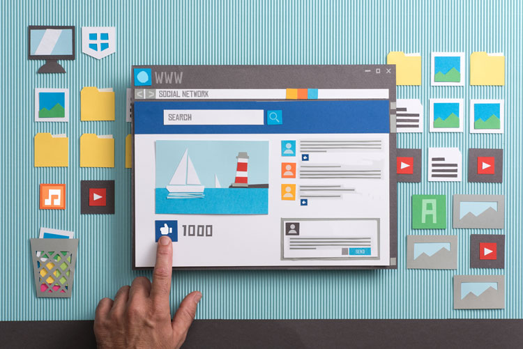
10. Did you add enough visual elements?
With significantly smaller screen sizes than on a desktop, it’s important to share information visually – “pictures are worth a thousand words”. With infographics, pictures, and videos you can get more information across. Make sure that your visual elements are high-resolution and that your videos are playable on mobile devices.