
Imagine you’re having dinner with your friends. One of them is super excited about the opening day of a new, funky art gallery. Of course, everyone immediately takes their mobile phones out of their pocket and checks out the company’s website to apply. Now, we just have to hope the art gallery has a mobile-friendly website that makes a great impression.
What is a mobile-friendly website?
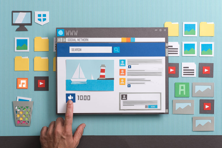
A mobile-friendly website offers a clean experience to visitors. The most important thing here is that the website doesn’t overwhelm or confuse people with too much text and images.
Every company approaches creating a mobile-friendly website differently:
- Some create an app that customers need to download and install. You’ve probably already seen your favorite clothing stores do this.
- Other companies create a mobile site first, followed by a design for desktop. This is a good option if most of your customers will use your website on their mobile devices.
- Some companies keep their desktop website and create a completely new mobile-friendly site.
- Finally, companies can choose to create a website with a responsive design.
The latter, creating a responsive design, is what most companies end up doing.
What is a responsive design?
A responsive website design is a design that is able to adapt to different resolutions, screen sizes, and devices. This means that no matter with which device a potential customer visits your website, it will work well and look great.

What are the benefits of a responsive website?
By creating a website with a responsive design you only need one website and one design. This allows customers to get used to your website and use it on their desktop, tablets, and mobile phones. Having one website with one design is not only great for branding but can also lead to new sales.
Furthermore, having a mobile-friendly website can be great for search engine optimization (SEO) because they often show up higher in the search results. This is even more important when you’re a local business that offers local services.
Best practices for a mobile-friendly website
Now, you probably agree with us when we say that you need a mobile-friendly website. When you’re creating a mobile-friendly website it’s good to keep the following best practices in mind:
- Create clear and simple menus. Preferably a vertical drop-down menu.
- Make sure you use clear and visible call-to-action buttons.
- Navigation, call-to-actions, and important content come first. Promotions and other distractions second.
- Make your logo tappable so that visitors can easily return to your homepage.
- Add a search box at the top of your website so that visitors can easily find what they’re looking for. To make it even better: allow auto-correct, autocomplete, sorting, and filters.
- Keep the purchase process as simple as possible so visitors don’t change your mind. A plus: give them the option to check out as a guest.